How to Design a Horror YouTube Logo People Remember (2026)
To design a horror YouTube logo people remember, build one simple, high-contrast symbol that still reads at 98 pixels inside a circle, then give it one color and one story that belong only to your channel. Everything else (texture, fog, extra detail) is optional, and most of the time it gets in the way.
This guide walks through the exact process a horror designer follows: from the idea behind the mark to the sizes YouTube actually uses, the tests that catch weak logos, and the mistakes that make a channel look amateur. If you want inspiration first, browse our horror YouTube logo ideas, then come back here to turn one into a real logo.
Why a Memorable Horror Logo Matters More Than a Scary One
Your logo shows up everywhere a viewer meets you: next to every video title, in comments, in search results, in the subscription feed and as a watermark on your videos. In almost all of those places it is tiny.
That changes the goal. A logo full of dripping blood, cracked text and a detailed creature might look great at full size, but at feed size it turns into a dark smudge. A memorable horror logo is one a viewer can recognize in half a second, even before they read your name.
- Scary is about mood. You can get mood from color and texture.
- Memorable is about shape. One clear silhouette beats ten clever details.
- Ownable is about story. The symbol should hint at your niche, not at horror in general.
How to Design a Horror YouTube Logo in 7 Steps
1. Start with your channel’s story, not with a skull
Write down three things: your niche, the feeling you want viewers to have, and one object or place that appears in your content again and again. A paranormal investigator might pick a flashlight beam or an EVP waveform. A creepypasta narrator might pick a candle, an old book or a closed door. A true crime channel might use a case-file stamp or a fingerprint.
Skulls, ghosts and pentagrams are not banned, but thousands of channels use them. If you choose one, give it a twist that is yours.
2. Choose the logo type
- Symbol or mascot: an icon or character. Best for gaming, storytelling and channels that want a face.
- Monogram: one or two letters (for example the initials of your channel) in a horror-styled frame. Clean and very readable small.
- Wordmark: your full name in custom lettering. Works for short names; long names become unreadable as a profile picture.
- Combination: a symbol for the profile picture plus a wordmark for the banner and intro. This is what most growing channels end up with.
3. Sketch silhouettes in black only
Before any color or effects, sketch 10 to 20 tiny black shapes about the size of a coin. If you cannot tell what a shape is when it is solid black, it will not work as a profile picture. Keep the two or three that are clear at a glance.
4. Design for the circle
YouTube crops your profile picture into a circle. Anything placed in the corners of your square file disappears. Keep the important part of the logo inside the central circle and leave some breathing room around it, so pointed horns, knives or letters are not cut off at the edge.
5. Pick one main color and one accent
Strong horror logos usually use a dark base, one light color for contrast and a single accent. Some reliable pairings by niche:
- Classic horror: black, bone white, blood red.
- Paranormal and ghost hunting: deep navy, pale cyan, white.
- Analog horror and found footage: black, off-white, a sickly VHS green or warning yellow.
- True crime: charcoal, paper beige, evidence red.
- Horror gaming: black with a neon accent such as toxic green or purple.
6. Choose lettering that survives small sizes
Distressed and dripping fonts are part of the genre, but use them with care. Keep the main letters bold and simple and add texture lightly on top. If your logo includes text, limit it to one or two short words or initials. Save the full channel name for the banner, where there is room for it.
7. Test it where viewers will see it
- The squint test: blur your eyes. The shape should still be recognizable.
- The 98 px test: shrink the logo to profile size and look at it on your phone.
- The dark and light test: check it on YouTube’s dark theme and light theme.
- The one-color test: print it in pure black and pure white. A strong logo works in both.
- The watermark test: place it in the corner of a dark video frame and a bright one.
Horror YouTube Logo Sizes and File Specs
Design big and export small. Work on a large square canvas (vector if possible), then export the versions below. Pair the logo with a banner built on the correct YouTube banner size so both assets feel like one system.
| Asset | Upload size | Where it shows | Design tip |
|---|---|---|---|
| Profile picture | 800 × 800 px, PNG or JPG | Cropped to a circle, displayed as small as 98 × 98 px | Keep the symbol inside the central circle |
| Video watermark | 150 × 150 px recommended, PNG, under 1 MB | Bottom-right corner of your videos | Use a one-color or transparent version |
| Master file | Vector (SVG, AI or PDF) or at least 3000 × 3000 px | Banner, intro, outro, merch | Keep layers and a transparent background |
| Banner lockup | Inside the 1235 × 338 px safe area of a 2560 × 1440 px banner | Top of your channel page | Use the wordmark version here |
Real Example: A Horror Logo That Works as a Full System
The best way to judge a horror logo is to see it in context, next to its banner, where most viewers will meet it. Here is one of our recent projects.
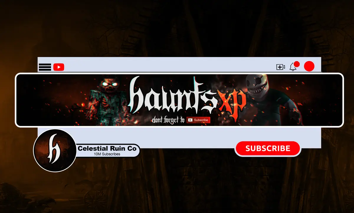
Notice what makes it work: the profile picture reads as one bold shape in a circle, and the banner repeats the same colors and mood at a larger scale. The logo is not a separate piece of art; it is the anchor of the whole channel identity.
Horror Logo Design Do’s and Don’ts
Do
- Build around one clear silhouette.
- Use strong contrast between the symbol and the background.
- Create a simple version for the watermark and a detailed version for intros.
- Keep your logo, banner and thumbnails in the same color family.
- Get vector or high-resolution source files so you never have to redraw it.
Don’t
- Put your full long channel name inside the profile picture.
- Use thin lines, tiny details or fine fog that vanish at small size.
- Copy a famous horror character, movie poster or game logo. It can get your channel in copyright trouble and it makes you look like a fan page.
- Change your logo every few months. Recognition comes from repetition.
- Rely on a free template that hundreds of other channels already use.
DIY, AI or a Horror Designer?
You can design a horror YouTube logo yourself with free tools, and for a brand-new channel that is a fine way to start. AI image tools are fast and cheap for exploring ideas, but they often produce generic results, broken lettering and logos that are hard to recreate consistently in a banner, watermark and intro. Licensing terms also vary by tool, so check them before you build a brand on an AI image.
A designer who works in horror every day gives you an original mark, a set of tested versions and source files you own. If you are weighing the budget, our guide to YouTube channel branding cost breaks down the options. Here is how our three packages compare if your logo is the priority:
- Basic ($45, 3 days): a horror banner only. Right if you already have a logo you love.
- Standard ($70, 4 days): banner plus a custom logo. The best fit for most creators reading this guide.
- Premium ($190, 7 days): banner, logo, watermark, intro, outro, full identity and source files. For channels ready to look professional in every video.
Every package includes unlimited revisions and a full refund if you cancel before work starts. Not sure which assets you need? Read what a horror YouTube branding package should include.
FAQ
What size should a horror YouTube logo be?
Upload your profile picture as an 800 × 800 pixel square PNG or JPG. YouTube crops it into a circle and shows it as small as 98 × 98 pixels, so keep the main shape centered. For the video watermark, use a 150 × 150 pixel PNG under 1 MB, ideally a simplified or transparent version of the logo.
What makes a horror logo memorable?
A memorable horror logo has one clear silhouette, strong contrast and a symbol tied to the channel’s own story rather than generic horror. It stays recognizable at tiny sizes, uses a limited color palette and appears consistently on the banner, watermark, intro and thumbnails so viewers learn to recognize it over time.
Can I use AI to make my horror YouTube logo?
You can use AI to explore ideas quickly and cheaply. The limits are generic designs, misspelled lettering, no vector file and difficulty repeating the same mark across a banner, watermark and intro. Licensing rules differ between tools, so read the terms. Many creators use AI for mood boards and a designer for the final logo.
Should my logo include my channel name?
Only if the name is short. Long names become unreadable inside a small circle. Most horror channels use a symbol or initials for the profile picture and watermark, and a full wordmark of the channel name on the banner and in the intro. That combination keeps the logo clean while still teaching viewers your name.
Get a Horror Logo Viewers Remember
Skip the trial and error. Our Standard package gives you a custom horror logo plus a matching banner for $70, delivered in 4 days with unlimited revisions. Want the watermark, intro and outro too? See the full packages or message us.