Horror YouTube Channel Branding Ideas for 2026
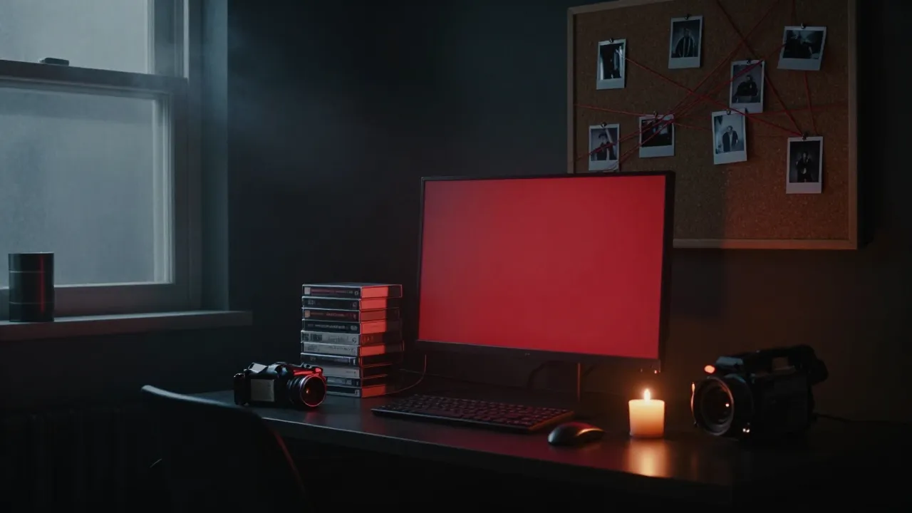
The best horror YouTube channel branding in 2026 does one job: it tells a new viewer what kind of fear you sell before they press play. Pick one visual idea that matches your subgenre, then repeat it across your banner, profile picture, thumbnails, intro and outro until people recognize you without reading your name.
Below are 10 branding ideas that work for horror, true crime, paranormal, creepypasta and horror gaming channels, plus the sizes you need and the mistakes that quietly make a channel look amateur.
Why horror YouTube channel branding matters more than ever
Horror is a crowded niche. Scroll the search results for “scary stories” or “paranormal investigation” and you will see dozens of channels with the same black background, the same red dripping font and the same stock skull. When everything looks alike, viewers click on whatever looks most finished.
Strong branding helps in three places:
- Search and suggested videos: a consistent thumbnail style and logo make repeat viewers pick you out of the feed.
- The channel page: a clear banner tells a visitor in one second what you upload and how often.
- Sponsors and collabs: brands and other creators judge you on how professional you look before they watch anything.
10 horror YouTube channel branding ideas for 2026
1. The analog horror VHS look
Tracking lines, washed-out colors, CRT scan lines and “emergency broadcast” layouts are still everywhere in analog horror. It works because the style itself feels unsettling. Keep it controlled: use the distortion on the background and keep your channel name clean, or it becomes unreadable on a phone. See how channels are using it this year in our roundup of horror YouTube branding trends.
2. The cinematic movie-poster banner
Treat your banner like a theatrical poster: one strong scene (a lit window in a foggy forest, an empty hallway, a lone figure), dramatic lighting and a centered title. This suits story narration, horror documentaries and film breakdown channels. Our guide to horror YouTube banner size and safe areas shows where the title must sit so it survives every screen.
3. The minimal black-and-red wordmark
Not every horror channel needs monsters. A sharp serif or condensed sans wordmark on near-black, with one red accent, looks premium and ages well. It is a smart choice for commentary, reviews and horror news channels that want to look like a publication, not a haunted house.
4. The case-file and evidence-board style
Manila folders, typewriter fonts, red string, redacted bars and polaroids instantly say “investigation.” It is the natural fit for true crime and unsolved mysteries. We break down more options in our true crime YouTube branding ideas.
5. The night-vision paranormal look
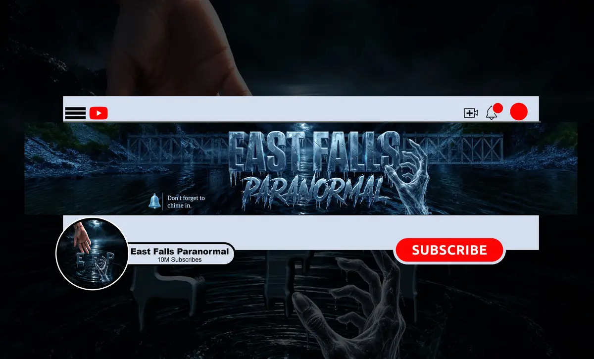
Green or monochrome night-vision tones, thermal-camera color, EMF meters and old maps give ghost hunting and paranormal channels a documentary feel. Pair it with a real location vibe: abandoned asylums, farmhouses or forest trails.
6. The campfire narrator for creepypasta
Scary story channels live on voice and atmosphere. Branding built around a storyteller works well: a candlelit room, an old book, a hooded silhouette or a vintage microphone. It signals “sit down, this will take a while,” which is exactly what long-form narration viewers want. For eight looks built just for narration channels, see our scary stories YouTube channel design ideas.
7. A mascot logo for horror gaming
Gaming audiences respond to characters. An original mascot (a demon, a masked figure, a creature) with bold outlines stays readable as a tiny circle in chat, on Twitch and in the YouTube feed. Keep it original: never trace a character from a game. For more directions, see our horror YouTube logo ideas.
8. The found footage camcorder frame
A REC dot, battery icon, timestamp and grainy low-light image turn your banner and thumbnails into “recovered footage.” It is instantly readable to horror fans and easy to repeat in every video, which is the whole point of branding.
9. A signature color that is not just red
Red on black is the default, which is why it rarely stands out. Consider a sickly green, cold cyan, bruised purple or old-paper amber as your one accent color. Use it on every thumbnail border, logo and lower third so the color itself becomes your signature.
10. A sound-and-motion signature
Branding is not only static images. A 3–7 second intro with a recognizable sound sting, and an outro that points to your next video, turn a look into an identity. Our guide on the ideal horror YouTube intro length explains how to keep it short enough that viewers don’t skip. You can watch examples in our horror intro portfolio.
Match your branding to your horror niche
Use this as a starting point, then push it until it feels like yours.
| Niche | Visual motifs | Color direction | Type style |
|---|---|---|---|
| Scary stories / creepypasta | Candles, old books, silhouettes, fog | Black, amber, deep red | Worn serif, hand-lettered |
| True crime | Case files, red string, polaroids | Charcoal, paper beige, red | Typewriter, condensed sans |
| Paranormal / ghost hunting | Night vision, maps, abandoned places | Black, night-vision green, cold blue | Clean sans, stencil |
| Analog horror | VHS noise, CRT lines, broadcast graphics | Faded teal, off-white, warning red | Retro TV, monospace |
| Horror gaming | Original mascot, glitch, neon rim light | Black, toxic green or blood red | Bold display, heavy outlines |
| Found footage | REC dot, timestamp, grain | Desaturated, low light | Camcorder UI, monospace |
| Horror documentary | Archive photos, film grain, light leaks | Sepia, black, muted red | Elegant serif |
Horror channel branding sizes for 2026
Great ideas fail if they are cropped. These are the sizes YouTube uses today:
| Asset | Recommended size | Key rule |
|---|---|---|
| Banner | 2560 × 1440 px | Keep text and logo inside the 1546 × 423 px safe area |
| Profile picture | 800 × 800 px | Shown as a small circle (around 98 px), so keep it simple |
| Video watermark | 150 × 150 px | Transparent PNG, under 1 MB |
| Thumbnail | 1280 × 720 px | 16:9, under 2 MB |
Branding do’s and don’ts for horror channels
Do
- Pick one main idea and repeat it everywhere.
- Test your logo at thumb size on a real phone.
- Leave dark negative space so the scary part has room to breathe.
- Use one or two fonts, not five.
- Keep editable source files so you can refresh your banner for Halloween or a new series.
Don’t
- Use dripping-blood fonts for small text; they turn into mush.
- Rely on gore to look scary. Atmosphere ages better and is safer for advertisers.
- Use characters, posters or stills from movies and games you don’t own.
- Change your look every month. Recognition needs repetition.
- Put your upload schedule outside the banner safe area.
DIY or hire a horror designer?
If you are still testing your niche, a free template can get you started. Once you know your subgenre and upload consistently, custom branding is usually worth it, because it is the difference between looking like a hobby and looking like a show. Our breakdown of horror YouTube channel branding cost compares DIY, freelancers and studios.
Not sure which assets you need? See what a horror YouTube branding package should include. At NightCaseStudio, packages are built around where your channel is right now:
- Basic, $45: a custom horror banner in 3 days. For channels whose logo already works.
- Standard, $70: banner plus a custom logo in 4 days. For new channels that need a recognizable face.
- Premium, $190: banner, logo, watermark, intro, outro, full identity and source files in 7 days. For creators ready to look like a finished show.
Every package includes unlimited revisions and a full refund if you cancel before work starts. Need Twitch panels, overlays, emotes or thumbnails? Message us and we’ll tell you what’s possible.
Horror YouTube channel branding FAQ
What colors are best for a horror YouTube channel?
Near-black with one strong accent works best. Red is the classic choice, but because so many channels use it, a sickly green, cold blue, purple or amber can help you stand out. Whatever you pick, use the same accent on your logo, banner, thumbnails and intro so viewers start linking that color to you.
How do I make my horror channel look professional?
Use a custom logo that reads clearly at small sizes, a banner with text inside the 1546 × 423 px safe area, and one consistent thumbnail style. Add a short branded intro and an outro that points to another video. Consistency across every touchpoint does more for a professional look than any single fancy effect. For the full step-by-step process, see how to build a horror YouTube channel brand.
What size should a horror YouTube banner be?
Upload your banner at 2560 × 1440 px. YouTube crops it differently on TV, desktop and mobile, so keep your channel name, logo and schedule inside the central 1546 × 423 px safe area. Put atmospheric details like fog, trees or buildings in the outer zones, where losing them on a phone won’t hurt.
Should a horror YouTube channel have an intro?
Yes, if it is short. A 3–7 second branded sting after your cold-open hook builds recognition without costing viewers. Long logo animations at the very start tend to get skipped. Many horror creators open with a scary moment first, then play the intro, and close with a matching outro that promotes the next video.
Turn your horror idea into a channel people remember
Get a custom horror banner, logo, watermark, intro, outro and full identity built around your niche with the Premium package for $190, delivered in 7 days with unlimited revisions. Just need a banner and logo? Compare all packages from $45.