Horror YouTube Branding Trends Creators Should Know (2026)
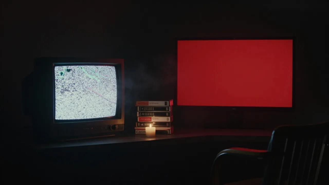
The biggest horror YouTube branding trends in 2026 are about restraint: lo-fi analog textures used with control, cinematic atmosphere instead of gore, and simple logos that still read as a tiny circle on a phone. Channels that look handmade and consistent are pulling ahead of channels that look templated or mass-produced.
Below are seven trends you can see on real horror, true crime, paranormal and horror gaming channels right now, what each one looks like, who it suits and where it goes wrong.
Why horror YouTube branding trends matter this year
Horror is not a small niche anymore. YouTube itself called out analog horror as a culture trend in October 2024, noting that videos related to the genre passed 500 million views in the first eight months of that year. More viewers means more channels, and more channels means the same black-and-red skull banner shows up again and again.
Two platform changes also push creators toward stronger branding:
- Thumbnail and title testing. YouTube Studio’s Test & Compare feature lets you test up to three titles and thumbnails on one video, and it picks the winner by watch time, not just clicks. Packaging that over-promises loses.
- Inauthentic content rules. Since July 15, 2025, YouTube’s monetization policy spells out that mass-produced, repetitive content, including “narrative stories with only superficial differences,” can lose monetization. That is a direct warning for scary story channels that all look and sound the same.
Trends are not rules. Use them to check whether your channel looks current, then keep only what fits your voice.
7 horror YouTube branding trends for 2026
1. Controlled analog horror texture
Static, CRT scan lines, emergency-broadcast layouts and VHS color bleed are still the signature look of analog horror. What has changed is how carefully the best channels use it. The distortion lives in the background, the grain sits on a separate layer, and the channel name stays crisp. Fully glitched logos may look cool at full size, but they turn into noise at thumbnail size.
2. Cinematic atmosphere over gore
More horror banners now look like film stills: color-graded, foggy, lit by one practical light source like a candle, a streetlamp or a red monitor glow. The fear comes from what is hidden, not from blood. This style reads as premium, keeps the channel friendlier to advertisers, and ages far better than shock imagery. It suits narration, horror documentaries and film analysis channels especially well.
3. Minimal logos built for the tiny circle
YouTube recommends an 800 × 800 px profile picture, but viewers mostly see it as a small circle next to titles, comments and Shorts. That is why detailed illustrated logos are giving way to monograms, single symbols and bold silhouettes: an eye, a key, a hooded figure, a single letter. If you want ideas that survive at that size, see our list of horror YouTube logo ideas.
4. Thumbnail systems instead of one-off thumbnails
Because Test & Compare rewards watch time, creators are building a fixed “frame” (one font, one accent color, a consistent logo corner or border) and only swapping the scene and the hook. You can test three versions without losing your identity. Your banner, logo and thumbnails should share the same color and type, so a viewer who liked one video recognizes the next one in the feed.
5. Short motion signatures
Long logo animations are out. The current pattern is a cold-open scare, then a 3 to 7 second branded sting with a recognizable sound, and an outro that pushes the next video. The sting becomes an audio logo: fans hear it and know whose video they are watching. We cover timing in detail in our guide to horror YouTube intro length.
6. One identity across every platform
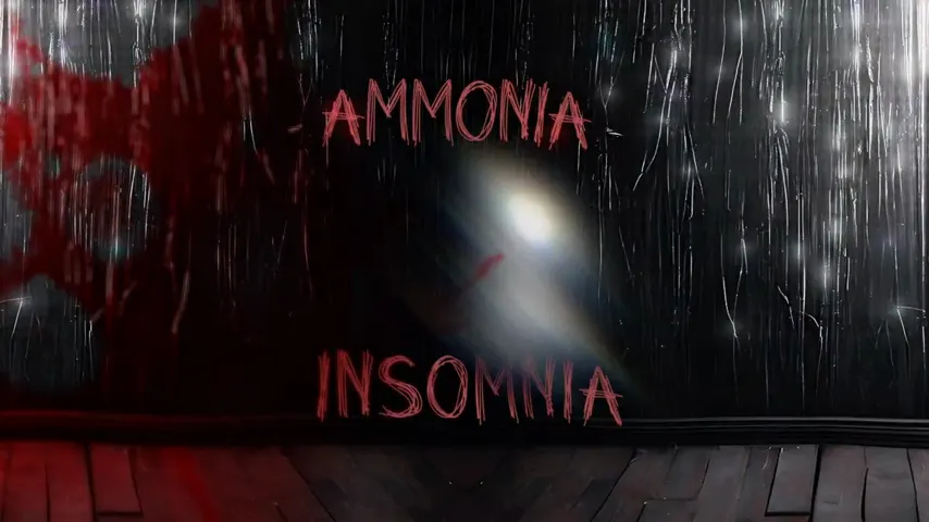
Horror creators rarely live on one site. The same person streams horror games on Twitch or Kick, posts clips on TikTok and Shorts, and uploads long-form stories on YouTube. The trend is a single kit: one logo, one accent color, one font pair, resized for each platform. Our horror Twitch branding sizes guide shows how to carry the same look across Twitch, YouTube and Kick.
7. Handmade identity in an AI-heavy feed
AI image tools made it fast and cheap to generate a spooky banner, and you can see it in the feed: glossy haunted houses, warped hands, melted lettering and banners that look like ten other channels. AI is allowed on YouTube, and realistic altered or synthetic video must be disclosed. But generic AI art has clear limits for branding: text errors, weak consistency from one asset to the next, and open questions about licensing. Many creators now use AI for moodboards and rough ideas, then build the final logo and banner by hand so the identity is theirs. Decide based on your goals, but know that looking unique is now a competitive edge.
Horror YouTube branding trends at a glance
| Trend | What it looks like | Best for | Watch out for |
|---|---|---|---|
| Controlled analog texture | VHS grain, scan lines, broadcast layouts | Analog horror, found footage, creepypasta | Unreadable glitched names |
| Cinematic atmosphere | Color-graded scenes, fog, one light source | Narration, documentaries, film breakdowns | Dark banners that go muddy on phones |
| Minimal logos | Monogram, symbol or bold silhouette | Every niche, especially gaming and Shorts | Being so plain it says nothing about horror |
| Thumbnail systems | Fixed font, color and logo corner | Channels testing titles and thumbnails | Clickbait that hurts watch time |
| Motion signatures | 3–7 s sting plus a matching outro | Story, true crime, paranormal channels | Intros long enough to get skipped |
| Cross-platform kit | Same logo and color on YouTube, Twitch, Kick, TikTok | Streamers and multi-platform creators | Stretching one image into every size |
| Handmade identity | Original art, custom type, source files | Channels planning to monetize and grow | Copying a trend so closely you blend in |
Sizes that still apply in 2026
Trends change, specs don’t move much. Design your banner at 2560 × 1440 px and keep the name and logo inside the central 1546 × 423 px safe area. Use an 800 × 800 px profile picture, a 1280 × 720 px thumbnail and a small square watermark. For the full breakdown, see our YouTube banner size guide for horror channels.
How to use these trends without losing your identity
Do
- Pick one or two trends that match your subgenre, not all seven.
- Check your logo and banner on a real phone before you publish.
- Lock one accent color and one font pair, and use them everywhere.
- Keep editable source files so seasonal updates take minutes, not days.
- Build thumbnails from a template so tests don’t break your look.
Don’t
- Rebrand every time a new style goes viral.
- Use stills, characters or posters from films and games you don’t own.
- Publish AI art with garbled letters or extra fingers in your banner.
- Rely on gore to look scary.
- Let your intro run longer than your hook.
For niche-by-niche directions (case files for true crime, night vision for paranormal, mascots for gaming), read our horror YouTube channel branding ideas.
Which package fits the trend you want?
- Basic, $45: a custom horror banner in 3 days. Good if your logo already works and you want a cinematic or analog refresh.
- Standard, $70: banner plus a custom logo in 4 days. The fastest way to get a minimal logo that reads at small sizes.
- Premium, $190: banner, logo, watermark, intro, outro, full identity and source files in 7 days. Covers the motion signature and cross-platform kit in one go.
All packages include unlimited revisions and a full refund if you cancel before work starts. Need Twitch panels, overlays, emotes or thumbnail templates? Message us.
Horror YouTube branding trends FAQ
Is analog horror still popular in 2026?
Yes. Analog horror series still draw large audiences, and YouTube highlighted the genre as a culture trend after related videos passed 500 million views in early 2024. The look has matured, though. Successful channels use VHS grain and broadcast graphics as texture, while keeping their channel name and logo clean and readable.
What colors are trending for horror YouTube channels?
Near-black backgrounds with a single accent color remain the standard. Deep red is still the most common accent, which is why channels that want to stand out are choosing sickly green, cold cyan, faded teal or amber instead. The trend is less about a specific color and more about using one accent consistently everywhere.
Can I use AI to make my horror channel branding?
You can. YouTube allows AI tools, and realistic altered or synthetic video must be disclosed. AI is fast and cheap for moodboards, but results tend to look generic, lettering often breaks, and matching a logo, banner and intro is hard. Licensing can also be unclear. Many creators use AI for ideas and a designer for the final identity.
How often should I update my horror channel branding?
Keep your logo and core colors for years; recognition depends on repetition. Refresh your banner when your content, schedule or series change, or for seasonal moments like Halloween. A full rebrand makes sense when you switch subgenre, when your look no longer matches your quality, or when you are preparing to approach sponsors.
Get a 2026-ready horror identity, not a template
The Premium package ($190) gives you a custom banner, logo, watermark, intro, outro, full identity and source files in 7 days, with unlimited revisions. Just need a fresh look? Compare all packages from $45.